
Written by:
Adriana Biarnes
Published on:
Mobile App Design
Brand Alignment
UX Design
Consumer Product
Visual System
award recognised · ecology
CLIENT
& the Table
PRODUCT
Mobile app for conversation card decks
AUDIENCE
Women building deeper connections with other women
STAGE
Pre-launch refinement
DURATION
10-day sprint
MY ROLE
Product Designer

Challenge
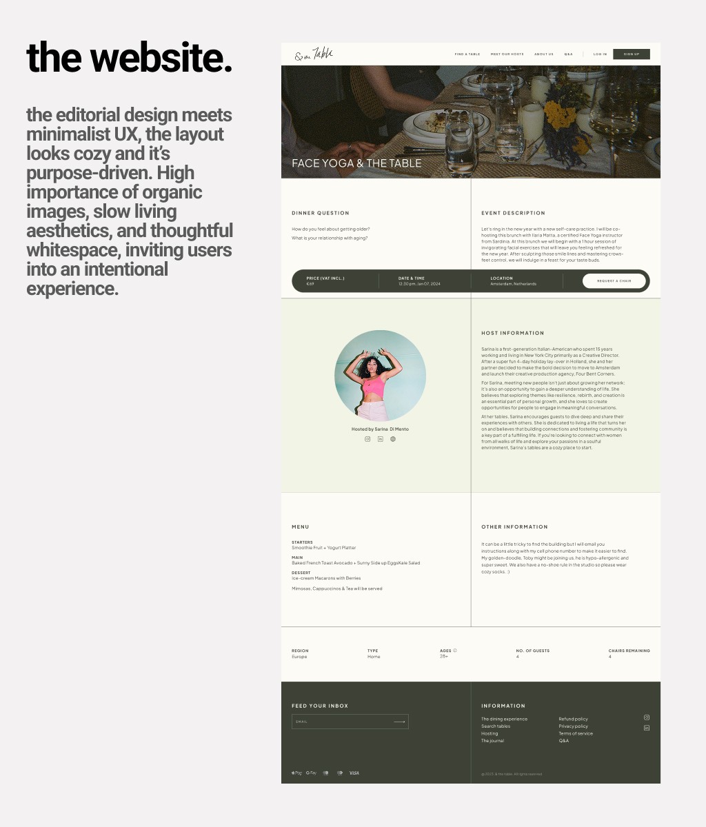
& the Table is a brand built around helping women build deeper friendships through curated conversation card decks. The website nailed it: editorial, warm, intentional. The kind of site that makes you feel something before you even read a word.
Then there was the app.
It worked. Users could browse decks, preview cards, buy the full version. All the functionality was there. But open the app after visiting the website and something felt off immediately. The warmth was gone. The personality was gone. It felt like a completely different product from a completely different company.
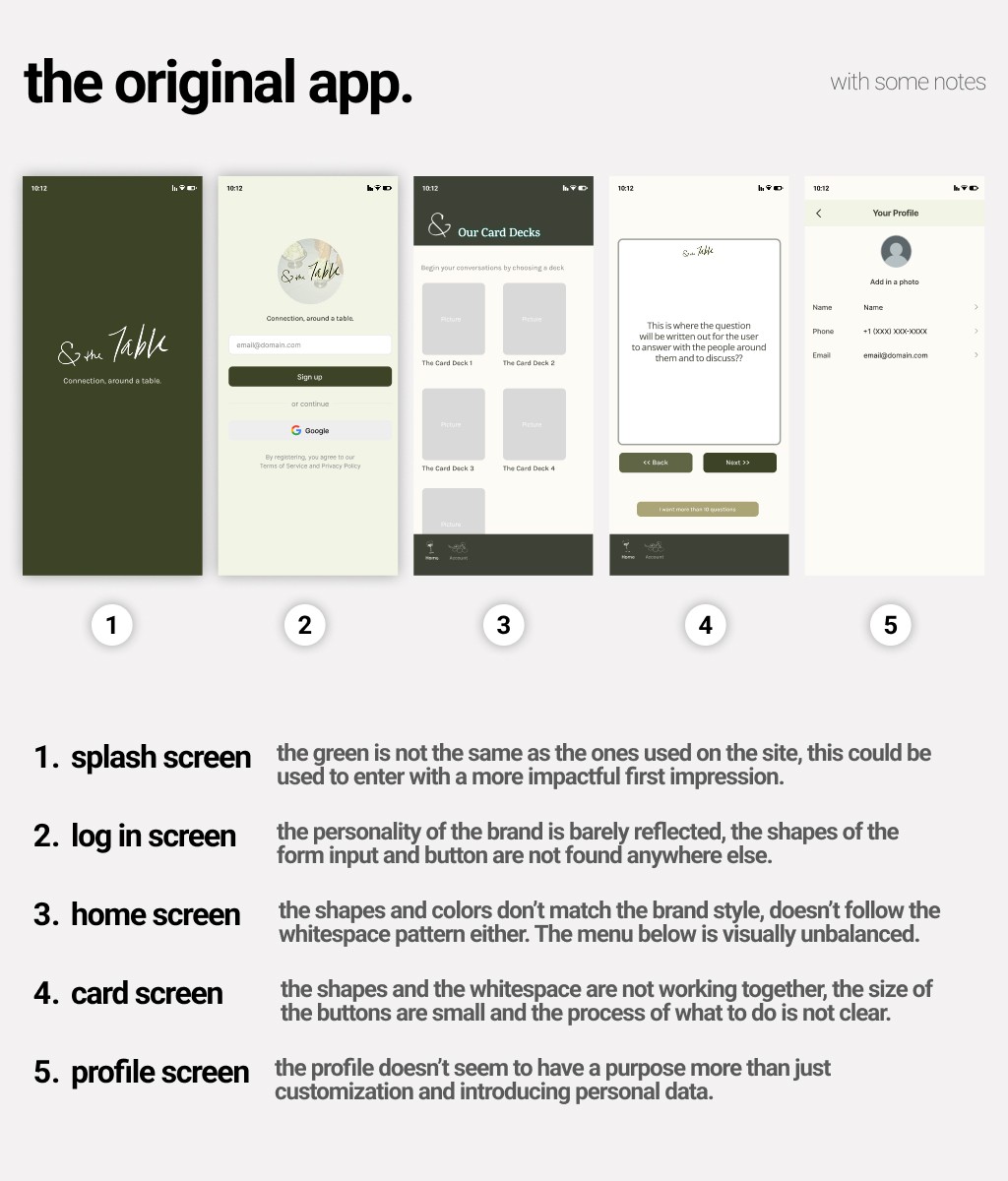
The problems were specific. The visual language didn't match the brand, so trust took a hit the moment someone opened it. Key actions like previewing, navigating, and buying were unclear, so users had to figure out what to do instead of just doing it. And the emotional tone that made the brand special? Completely absent inside the app.
This kind of gap is more common than people think. You invest in getting the brand right, and then the product ships with a different visual system, different shapes, different energy. The brand promise and the product experience stop telling the same story.
Approach
This wasn't a rebuild. The MVP architecture was already defined, the backend and purchase system were staying as-is, and the timeline didn't allow for anything structural. So the question became: what's the highest-impact work I can do within those constraints?
I focused on three things.
First, brand continuity. Every visual decision in the app needed to trace back to what the website had already established: the color palette, the organic shapes, the warmth of the photography, the typography choices. The app needed to feel like it came from the same place.
Second, flow simplification. The preview to purchase journey had friction in it. CTAs were unclear. Navigation between screens required too much interpretation. Small structural adjustments, not a rebuild, just clarity.
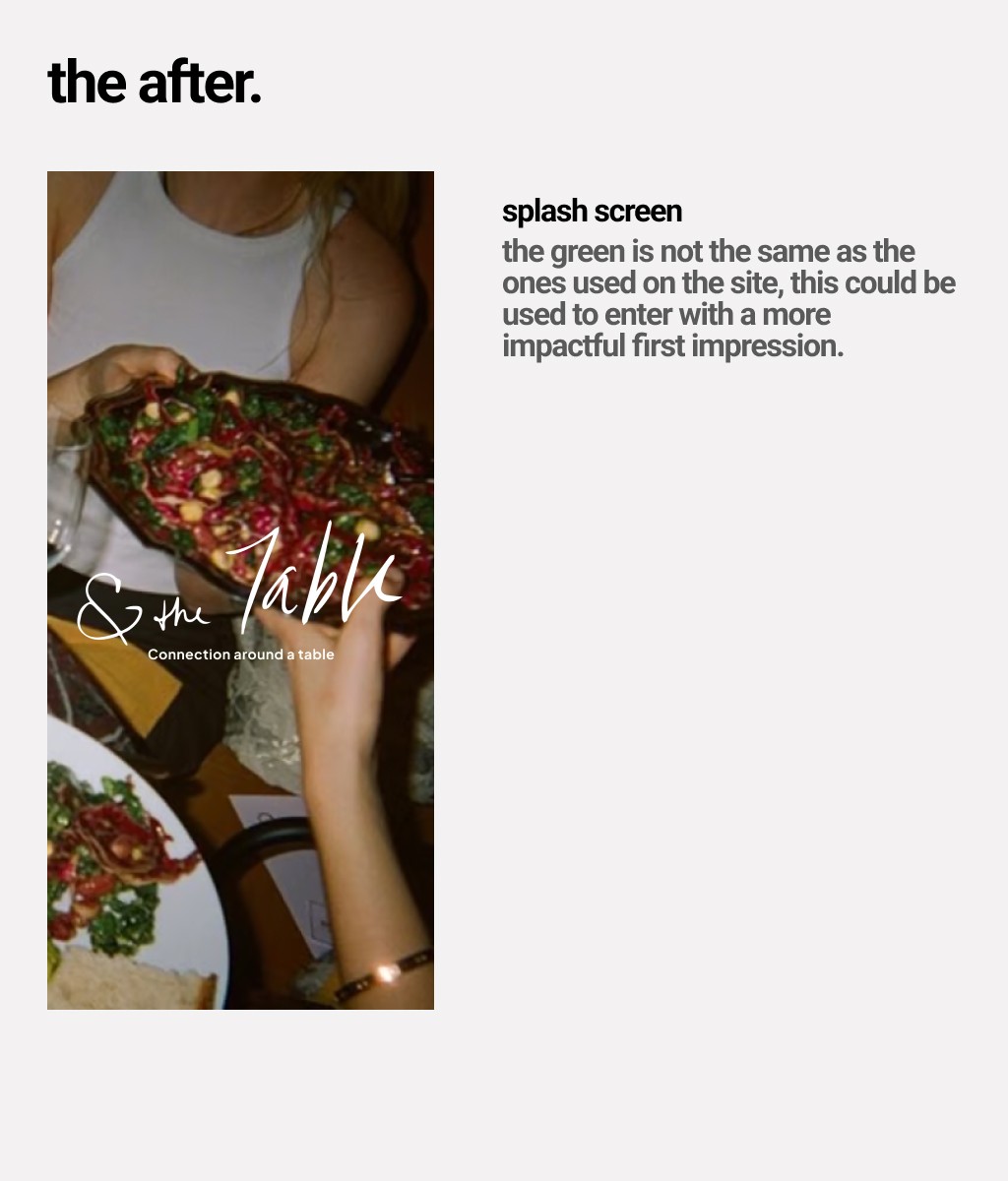
Third, emotional reinforcement. The moments that matter most in this product, opening the app for the first time, choosing a deck, reading a card question, those needed to feel intentional. Not generic.
Solution
Here's what changed.
The color palette from the website was brought into the app properly. Organic shapes and doodle illustrations, which were already part of the brand identity on the menu and website, were used as visual elements throughout. Film-like photography replaced flat placeholder imagery. Typography and spacing were unified across all screens.
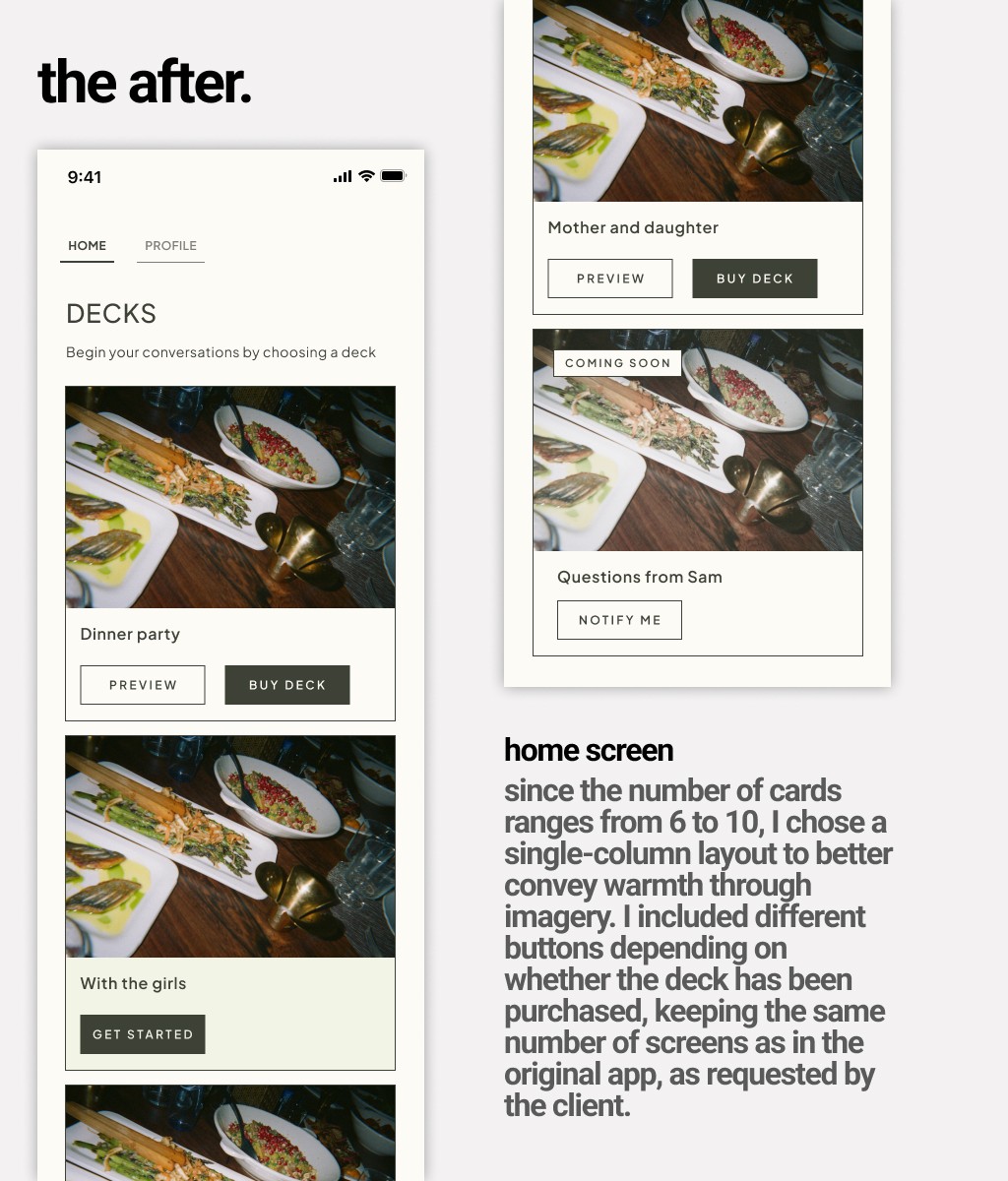
The home screen moved to a single-column layout with full-width imagery per deck card. Different button states depending on whether a deck was purchased, previewed, or coming soon: clear, no guessing.
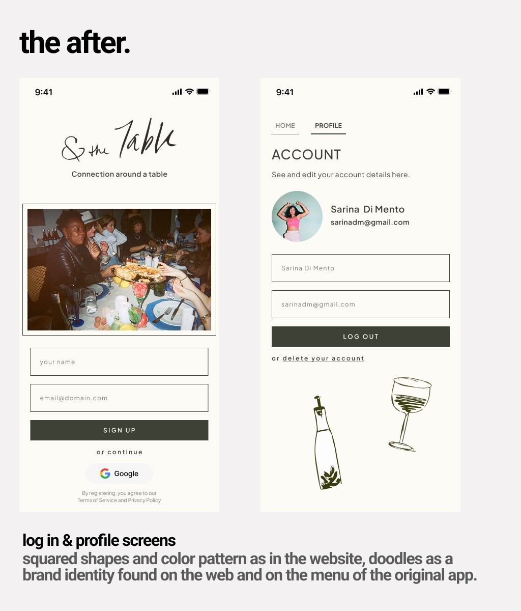
The login and profile screens picked up the squared shapes and color pattern from the website. The doodle illustrations that exist in the brand's physical materials showed up here too, making the app feel like part of the same world.
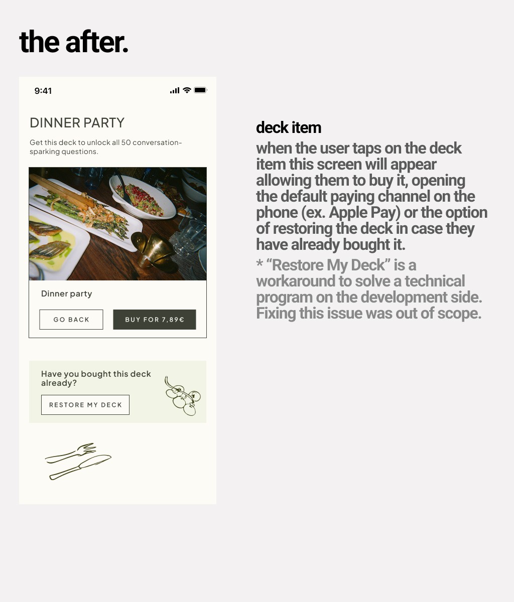
The deck item screen gave users a clear path: preview the deck, buy it, or restore it if they'd already purchased it. One focused action per state, no competing decisions.
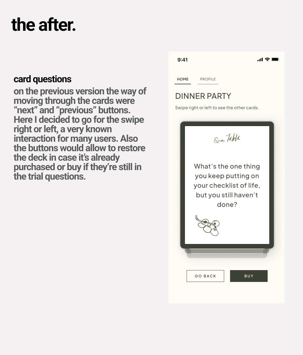
Card navigation became a swipe interaction. The question fills the card. The brand logo sits quietly at the top. It finally felt like the product the brand deserved.
Results
The app went from feeling like a generic MVP to something that actually represented the brand.
Visual consistency across every screen. Clearer flows through preview and purchase. Reduced friction at every decision point. A scalable visual foundation for future features.
Sam, the founder, said the new design finally felt like what she had in mind. The old app didn't represent her vision. The new one did.
The app is launching on the App Store soon, and for the first time, the product and the brand are telling the same story.
Sometimes the gap between a good brand and a good product is smaller than you think. It just needs someone to close it.

