Written by:
Biarnés, Adriana
Published on:
UX Research
UX/UI Design
Accessibility
User Testing
CRO
CLIENT
Orygen
PRODUCT
Platform to connect landowners with businesses
AUDIENCE
Landowners 55+ & companies buying CO2 credits
STAGE
Post-launch refinement
DURATION
10-day sprint
MY ROLE
UX/UI Designer

Challenge
Orygen had a genuinely good idea. Connect landowners who have forgotten or unused land with businesses that need to plant forests to offset their carbon emissions. The land gets a purpose. The company meets its sustainability goals. Everyone wins.
The website told a different story.
99.2% of visitors in the landowner funnel left without doing anything. Not 50%. Not 70%. Ninety-nine point two percent.
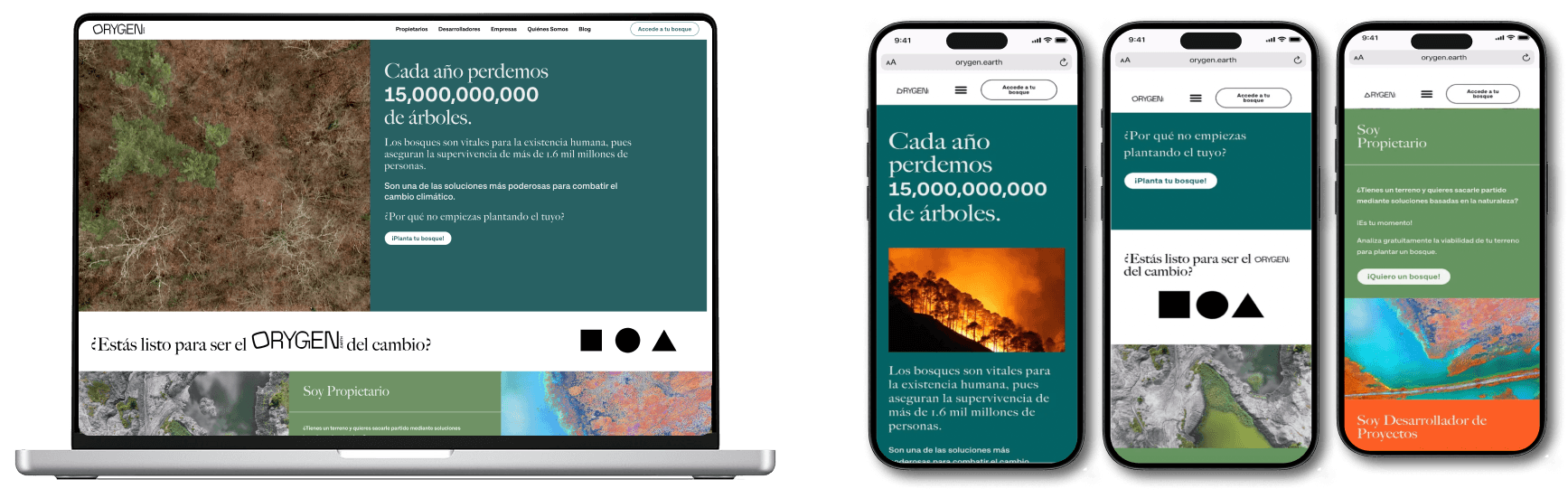
When Orygen came to me, the problem wasn't obvious from the outside. The site looked fine. It had personality. But the moment you understood who their main audience was, everything became clear.
Landowners aged 55 and over. People who inherited land from parents who passed away, land they feel guilty about leaving untouched, land they don't have the skills, money, or time to deal with. They're not browsing the internet looking for solutions. They stumble across Orygen by chance, usually through an ad, already a little skeptical, and then they hit a website that feels playful, uses the word "gift," and asks them to hand over personal information to a company they've never heard of.
They leave. Almost every single one of them.
This wasn't a design polish problem. It was a trust problem. And before we could fix the design, we had to understand exactly who we were designing for and why they didn't believe us.
Approach
We started by talking to people.
16 usability tests. 5 in-depth interviews. Real landowners, real reactions, recorded and documented. The goal was to understand not just what they did on the website but what they were thinking and feeling while doing it.
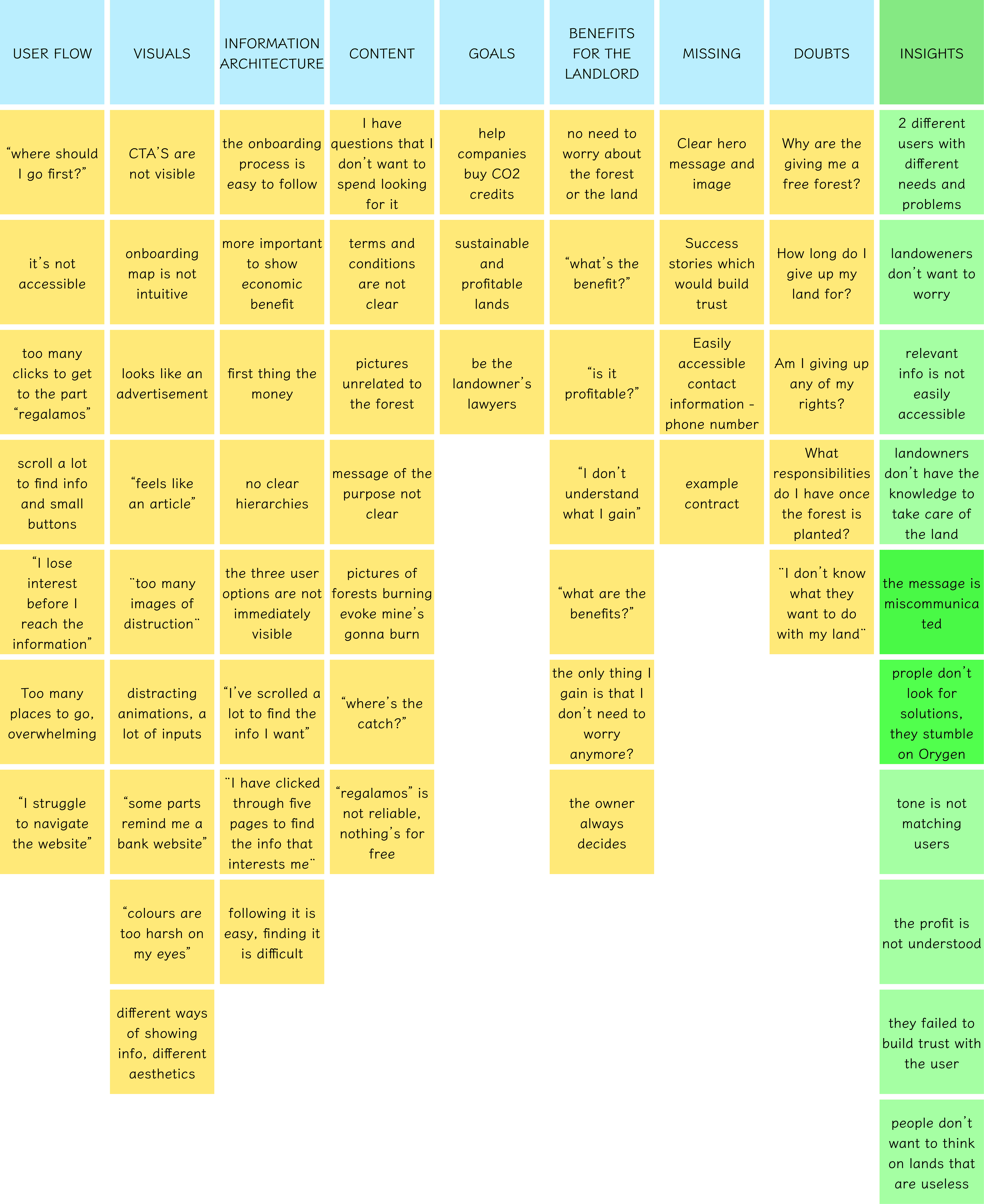
What came out of the research was specific. Users didn't understand what they were gaining. The word "gift" made them suspicious. Images of burning forests made them anxious rather than motivated. The onboarding map wasn't intuitive. CTAs were invisible. And the overall tone, playful and modern, felt completely wrong for someone in their 60s who just wants to know: is this legitimate, will this cost me anything, and what happens to my land?
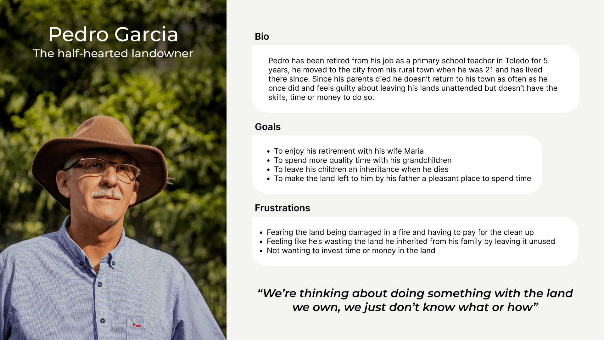
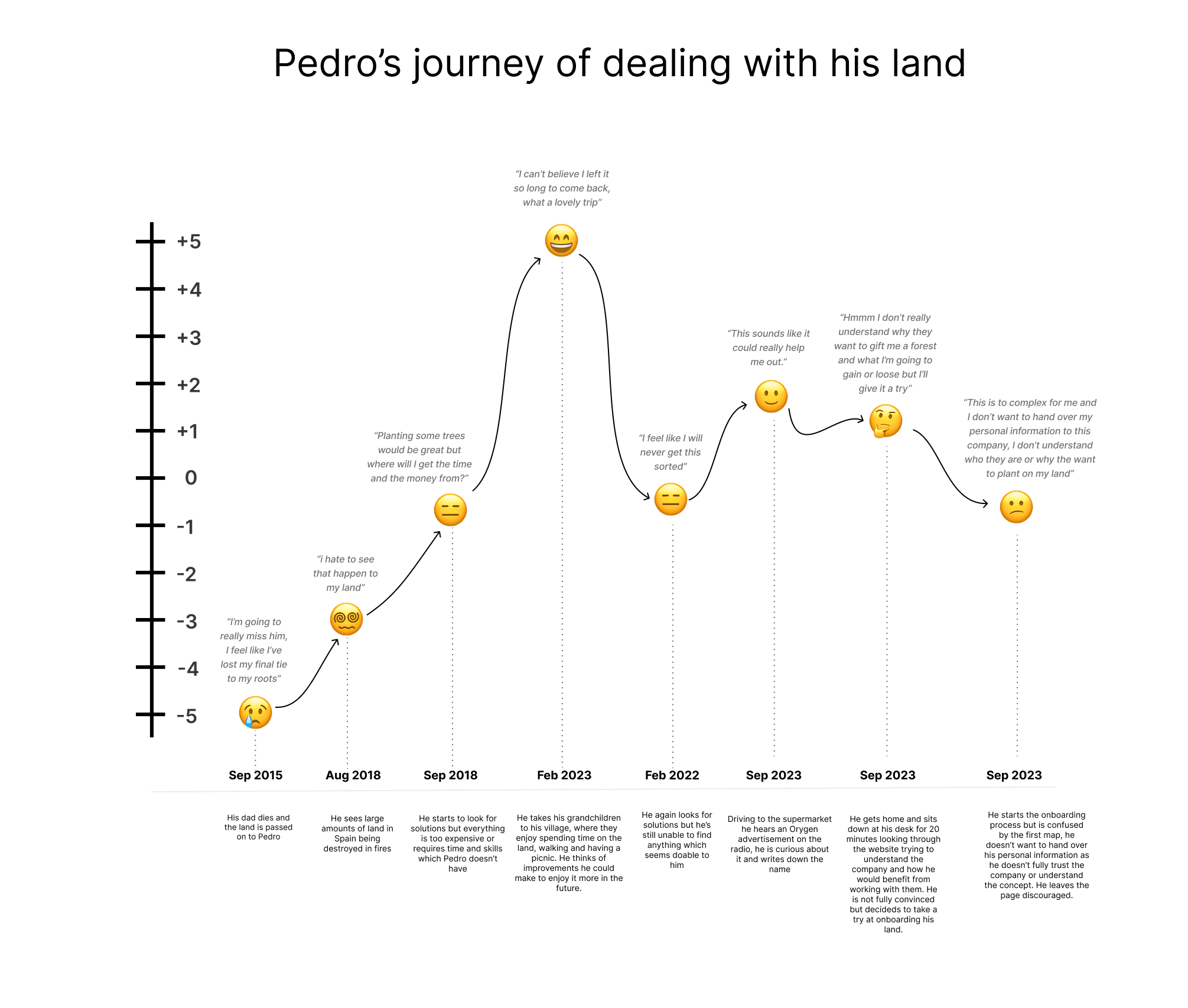
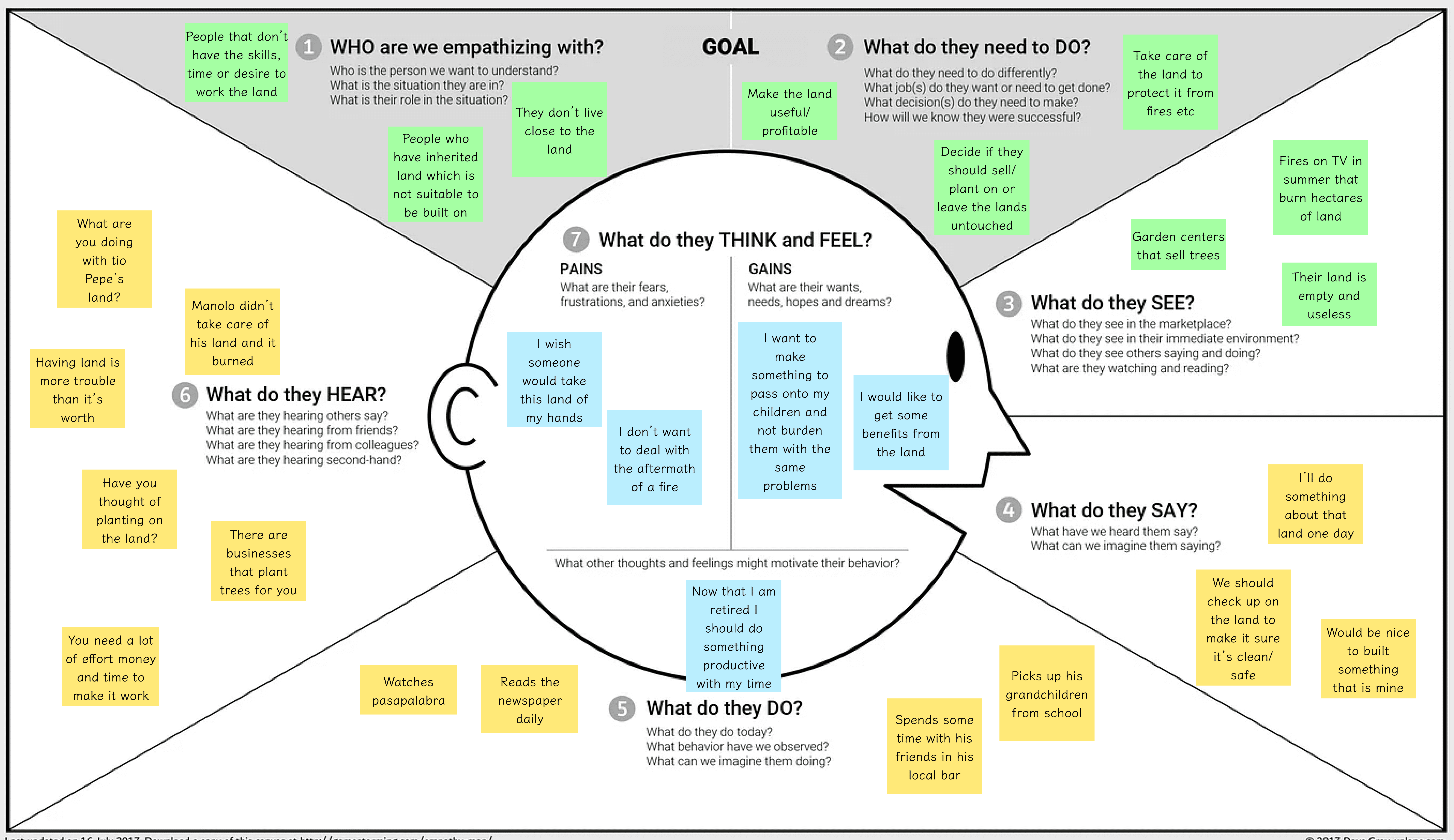
Pedro, our primary persona, inherited land from his father. He thinks about it sometimes. He worries about fires. He'd like to do something with it but every solution he's found has been too complicated or too expensive. He hears a Orygen radio ad, looks it up, spends 20 minutes trying to understand the website, doesn't trust it, and leaves. Frustrated. Again.
That journey informed every design decision.
Three things needed to happen. One: split the experience. Landowners and companies are completely different users with completely different fears and goals. Mixing them on the same page created confusion for both. Two: earn trust before asking for anything. The messaging had to answer "what do I get" and "what's the catch" before a user even had to scroll. Three: make it genuinely accessible. Not just slightly bigger text. WCAG 2.0 compliant, proper contrast, clear navigation, no cognitive overload.
Usability testing
The usability testing revealed something important about this specific audience: what Orygen offers is not something they are actively looking for. Unlike a B2B SaaS where the user comes with a defined problem, Pedro has a vague discomfort, not a clear intent. That changes everything about how you design the entry point.
The word "regalamos" (we gift) was a major trust blocker. Users immediately asked "what's the catch?" or assumed there was something fraudulent. It was removed and replaced with direct, transparent benefit language: income generation, fire protection, increased land value.
Splitting the user paths was the single most impactful structural decision. The original site tried to serve landowners and companies from the same homepage, which meant neither group saw content that felt relevant to them immediately. Separating the paths cut the cognitive load on the landing page in half and let us speak directly to each user's actual concerns.
Accessibility
Accessibility went beyond font size. We checked and fixed color contrast ratios, simplified form fields, improved button sizing, added alt text throughout, and ensured keyboard navigation worked properly. These were not aesthetic decisions. For a 65-year-old user on a mobile phone, they were the difference between staying and leaving.
The onboarding flow was reduced from 7 screens to 6 and from 9 user actions to 7. Small change on paper. Significant difference in completion.
Solution
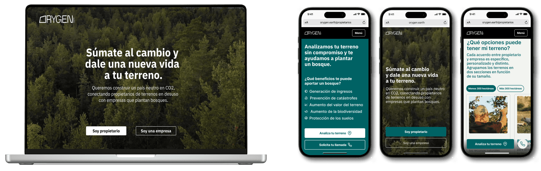
The redesigned site splits immediately: "Soy propietario" or "Soy una empresa." From the first second, users know they are in the right place and that what follows is relevant to them.
The landowner path leads with the benefits in plain language: income generation, fire prevention, increased land value, biodiversity. The question "what's the catch?" is answered before it's asked. The tone is calm, clear, and respectful. Nothing playful. Nothing that suggests complexity.
Large, nature-connected imagery. Earthy greens and tones that feel aligned with the mission without feeling like an environmental campaign poster. Typography scaled properly for readability. CTAs prominent, specific, and low-commitment: "analyse your land" rather than "sign up now."
The onboarding flow was simplified and each step was given a clear purpose. Users always know what they're doing, why, and what comes next.
Results
Bounce rate dropped from 99.2% to 73%.
That's still not perfect, but it's a 26-point improvement on an audience that doesn't come to the site with strong intent. More users completed the onboarding journey. Post-launch interviews confirmed users found the new site significantly easier to navigate and felt the company was legitimate and clear about what it offered.
Understand your crowd. Designs and content that speak directly to their needs, clear navigation, and honest communication go a long way when your users are hesitant by default.