
Written by:
Biarnés, Adriana
Published on:
Brand & Naming
Product Design
AI Product
Landing Page
CRO
CLIENT
EARO (formerly AdManager.fm)
PRODUCT
AI-powered audio advertising platform
AUDIENCE
Small and medium business owners, worldwide
STAGE
Pre-launch: rebrand and acquisition flow
DURATION
10-day sprint
MY ROLE
Product Designer · Brand, naming and visual identity

Challenge
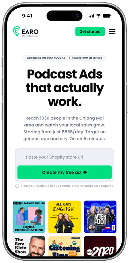
EARO turns a website link into a radio ad. You paste your URL, and about 60 seconds later you hear your own business advertised in a professional voice, ready to go on air.
The client had done the hard product thinking before I joined. Their brief mapped the full acquisition flow in detail: localisation by IP, the AI generation moment, a visual budget slider, account creation that happens quietly in the background. It was one of the clearest briefs I've worked from. What came next was the layer a visitor actually meets. The product needed a name, an identity, and a page that turns all that logic into a decision.
My first question was the one that shapes everything after it: what should someone feel in the first five seconds?
Their answer put the real tension on the table. They wanted EARO to feel current, the kind of product a younger, digital-native crowd would take seriously. They also knew exactly who pays for it: a small or medium business owner who has never bought a radio ad and assumes it takes thousands and a studio. The brand had to feel modern to both of them without leaving either one out.
The second challenge was volume. EARO has a lot going for it, and the early content tried to say all of it: every benefit, every objection, every proof point. Each line was true. Together they were too much to read. People don't study landing pages. They scan, and they decide.
Approach
I started with the name and the identity. You need that before digging into the design a page for a product that hasn't settled what it is.
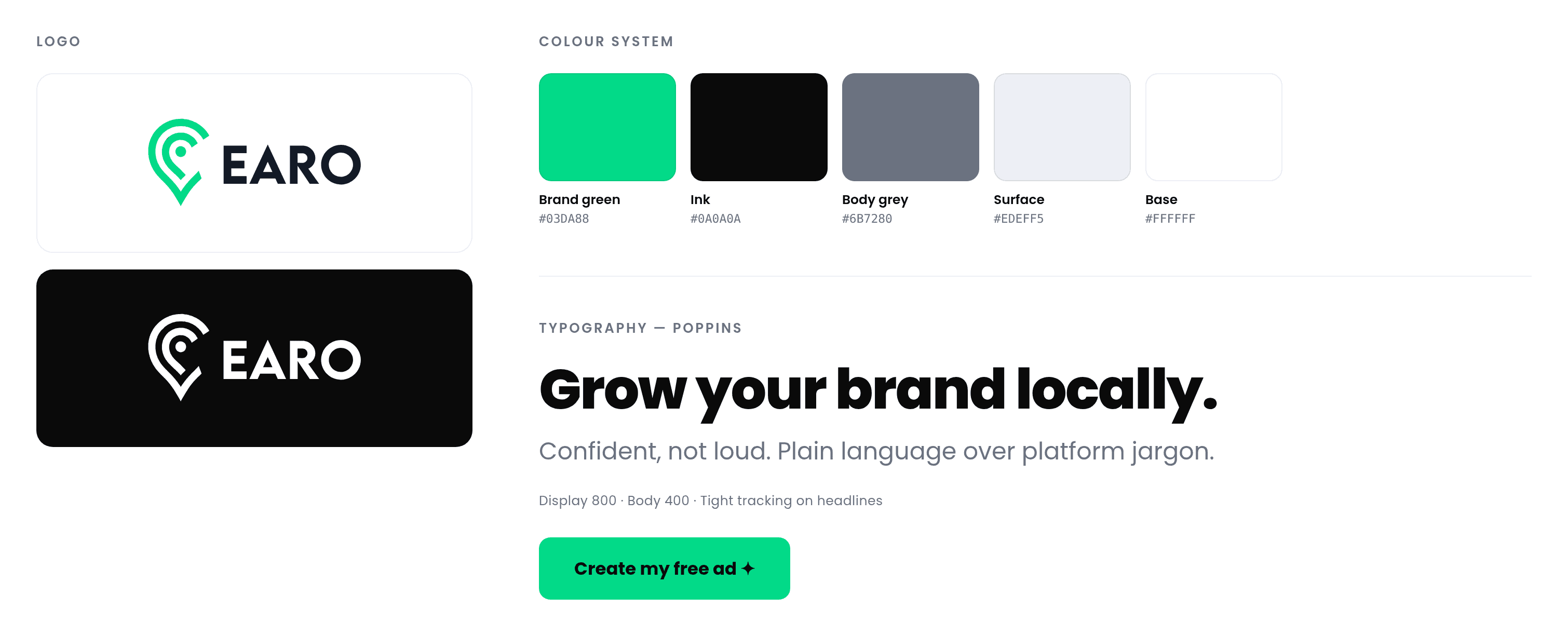
EARO comes from an obvious place: ear. The whole product is about being heard. It also had to hold up in every market the platform was launching in, so it needed to be short, easy to say, and free of meanings that break in translation. The visual identity grew from there: logo, colour system, and a tone that reads as confident without getting loud.
Then I changed how the product introduces itself.
The brief organised the flow as Land, Convert, Refine, Launch. That's the right model for the team building it. A first-time visitor moves differently, so I rebuilt the page around their sequence instead: prove it's real, let them hear it, make the price feel safe, then ask.
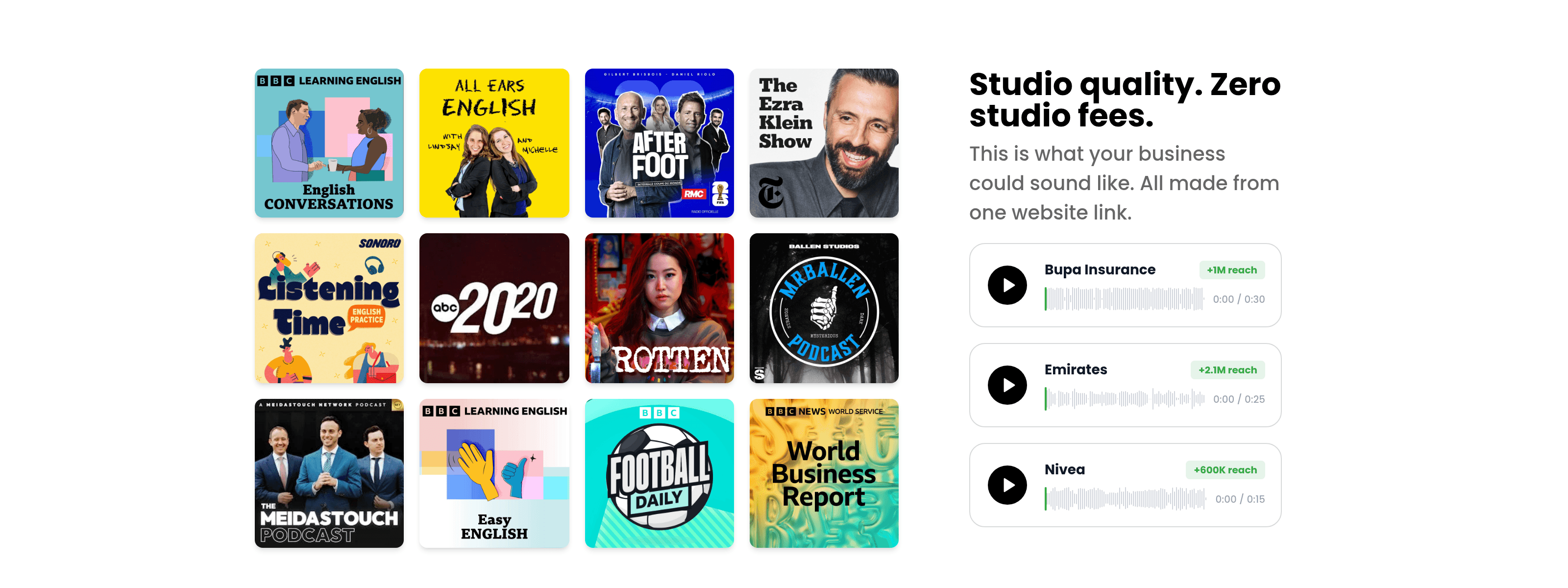
The biggest call was where to put the magic moment. With a product like this, the instinct is to explain first: how the AI works, what it does, and only then an invitation to try. I went the other way. The audio comes first. You hear a real ad for a real brand before you read a single benefit, because no paragraph is as convincing as hearing it.
Copy took more rounds than anything else. The client and I settled on one rule: every line has to make sense to someone who has never run a digital campaign, without talking down to someone who has. So most of the explanation went, and what stayed was whatever removes fear. A price with a number. A time with a number. "Stop anytime" wherever money shows up.
Localisation shaped the structure as well. The page adapts by market, with local currency, local publishers and local payment methods, so I designed it as a system rather than a fixed page. Sections swap content by region and the hierarchy holds.
Solution
A complete brand and a conversion-focused acquisition experience, designed end to end.
A new brand and a conversion-focused acquisition experience, designed end to end.
What shipped:
A brand identity to replace the working name. Name, logo, colour system and visual language, built to work across languages and markets.
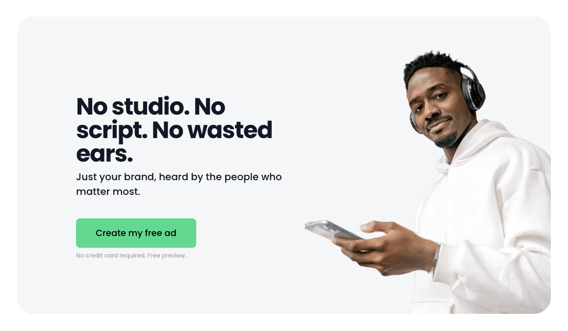
A landing page that leads with proof. The hero opens with a localised reach number and a price, followed right away by real audio samples. You hear the product before you're asked to understand it.
The magic moment, moved upstream. Free ad generation happens before any account creation, so there's no signup wall between a visitor and the thing that convinces them.
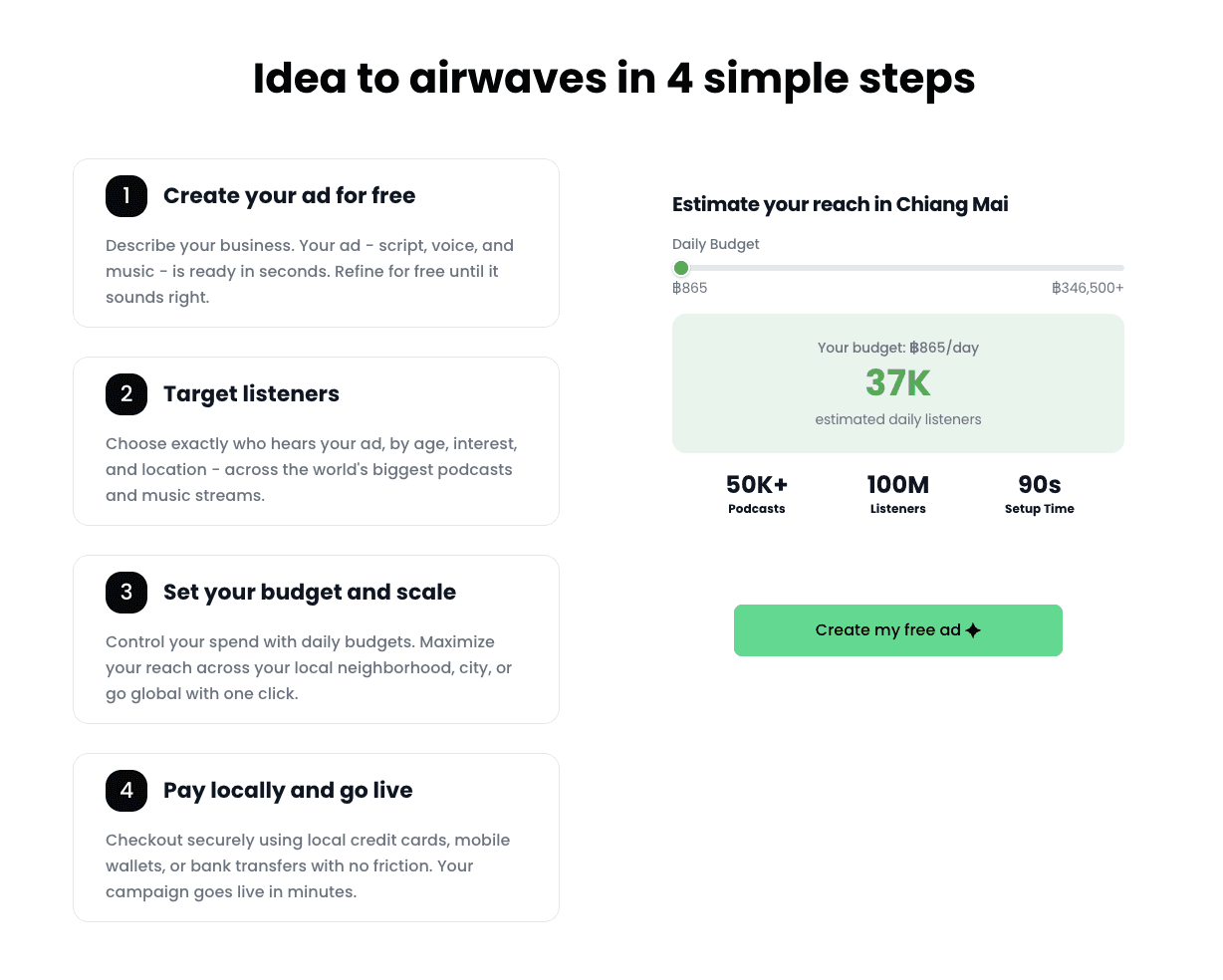
A visual reach estimator. A budget slider that turns money into audience, so setting a budget feels like choosing your reach instead of committing spend. "Stop anytime" sits next to every point where cost appears.
A plain-language "how it works" section in four steps: create, target, budget, launch. No platform jargon and no assumed knowledge.
A localisation system. Layouts that swap currency, publisher logos, payment methods and language by region without a redesign.
Copy rebuilt from the ground up. It went from comprehensive to short and concrete, readable in one scroll.
Results
Delivered in a 10-day sprint:
EARO went from a strong internal brief with a working name to a launched brand with a live acquisition page.
A full brand identity: naming, logo, colour and tone
An acquisition flow where the product's strongest moment is the first thing a visitor experiences
Copy that works for first-time advertisers and experienced media buyers alike
A page system built to scale across markets and languages, not a single fixed design
The client had the product figured out. My job was to make a stranger get it in five seconds.

Bring your roadmap and your deadline. I'll tell you whether this is a sprint, a partnership, or neither.