
Written by:
Biarnés, Adriana
Published on:
PRODUCT DESIGN
UX ANALYSIS
MOBILE APP
UX DESIGN
CLIENT
Symmetry
PRODUCT
Strength training app with workout logging, AI coaching and social rankings
AUDIENCE
Lifters at every level, from never trained to advanced
STAGE
Live product, activation problem
DURATION
1 week
MY ROLE
Product Designer · Data analysis, hypothesis and prototypes

Challenge
Symmetry is the kind of product most fitness teams would like to have. 1.8 million downloads, a million active users, 4.9 million completed workouts, 4.8 stars.
That's what made the number they brought me so interesting.
Around 50% of users who start their first workout log zero sets. They open the app, tap Start, and don't record anything. No weight, no reps, no checkmark.
The team asked for three options rather than a single recommendation, which is the right way to run an activation problem. It also meant the diagnosis had to be right first. Three options built on the wrong read are three wrong options.
The data pointed somewhere specific straight away. Completion wasn't flat across the user base. It lined up almost perfectly with experience:
Experience | Completion | Equipment | Completion |
|---|---|---|---|
Advanced | 54.77% | Commercial gym | 53.63% |
Intermediate | 53.61% | Small gym | 49.67% |
Beginner | 49.71% | No equipment | 48.18% |
Never trained | 44.82% | Calisthenics | 48.00% |
Ten points separate someone who has trained for years from someone who has never trained at all. The less a user already knows, the more likely they are to leave.
I've trained for years myself, and from that side it's easy to forget how much a beginner is missing. Anyone who has spent time in a gym carries a lot of quiet knowledge: what each machine does, roughly how many reps go in a set, some basic anatomy. You can't see any of it, and it's exactly what lets you look at a table of weight, sets and reps and know what to do. Someone new has no reason to have that map yet.
Equipment tells a similar story from another angle. In a commercial gym there are machines and variables worth tracking, so logging weight and reps pays off in progression. Calisthenics sits at the other end: bodyweight, few tools, a minimal setup. Those users tend to want a fast, essential log focused on the movement. The screen was built for Symmetry's core lifters, and it serves them well. The newer and lighter-touch users need something slightly different.
Both patterns point the same way. Users who already know how to log a set stay. Users who don't, leave.
Ten points separate someone who has trained for years from someone who has never trained at all. The drop-off is inversely proportional to experience: the less the user knows, the more likely they are to leave.
I have trained for years, and from the inside it is easy to forget how much that costs a beginner. Anyone who has spent time in a gym carries a pile of tacit knowledge. They know what each machine does, roughly how many reps belong in a set, a bit of anatomy. None of that is visible, and all of it is what lets you look at a table of weight, sets and reps and immediately know what to do. A new lifter has no reason to have that map.
Equipment tells the same story from a different angle. A commercial gym has machines and variables worth tracking, so logging weight and reps is genuinely useful for progression. Calisthenics is the opposite: bodyweight, few resources, a minimal approach. That user leans toward a fast, essential log, focused on getting the movement rather than the detail. Same product, two different needs, and one screen serving only one of them well.
Both patterns say the same thing. If the user already knows how to log a set, they stay. If they don't, they go.
Approach
I broke the problem into three questions.
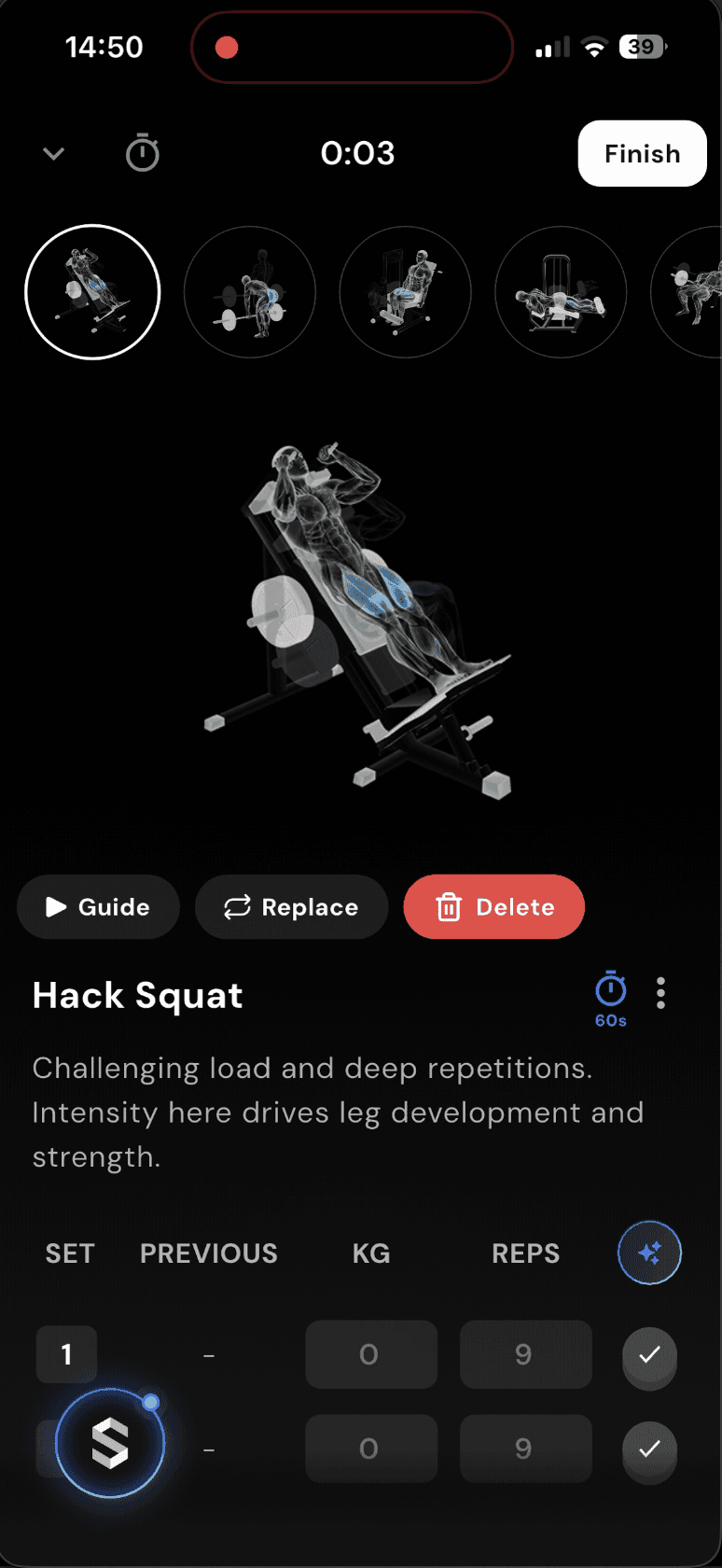
What is stopping the user? A screen that doesn't say what to do next. Tapping Start opens a full toolkit: timer, muscle map, Guide / Replace / Delete, an exercise carousel, an AI button, and a set table with a grey 0 and a checkmark that looks already ticked. For an experienced lifter, that's everything in reach. For a first-timer, it's six things at once with no clear first step. At the exact moment they're meant to log, there's no single obvious action, so they hesitate. They came to train, not to figure out an interface.
Why is it happening? "Start workout" sets an expectation that the app will lead. What opens is a powerful workspace that assumes you already know how to log. So two things land at once: the expectation doesn't match, and there's no clear hierarchy to follow. Without an obvious primary action, a newer user stalls.
Why this hypothesis over the others? I had four candidates:
A. The component is unclear. The control itself, the grey
0and the pre-ticked checkmark, doesn't make it obvious what to tap to count a set.B. Mismatched expectation. "Start" suggests guidance. The user expects to begin training, not to fill something in.
C. Overload. Several elements compete with no primary action leading, and Delete is the most visually prominent button on the screen.
D. The exercise intimidates. The first exercise may use jargon a beginner doesn't know, need a machine they don't have, or require technique they haven't learned.
The data narrows it down. A doesn't hold up as the main cause: the component is identical for everyone, and experienced lifters use it without trouble, so it can't explain a gap that follows experience. D does fit the curve, since an intimidating exercise hits beginners harder. But it's a symptom of the same gap. A beginner feels lost with an unfamiliar exercise mostly because nothing on the screen tells them what to do with it. Swapping the exercise would fix one case and leave the cause in place.
What really changes with experience is whether someone arrives with a mental model of how logging works. Experienced users fill the gap with what they already know. Beginners can't. So what's missing is guidance, which is B and C together: an expectation that doesn't match, and no clear action to follow.
I checked this against the category. Hevy, one of the most popular apps in the space, uses an almost identical logging component with a different frame around it: a hierarchy strong enough that everything else steps back and the primary action stays visible. I don't have their numbers, so this is a UI observation, not a benchmark. It still supports the read that the component itself is fine. What matters is how it's presented, what it promises, and how many decisions arrive at the same time.
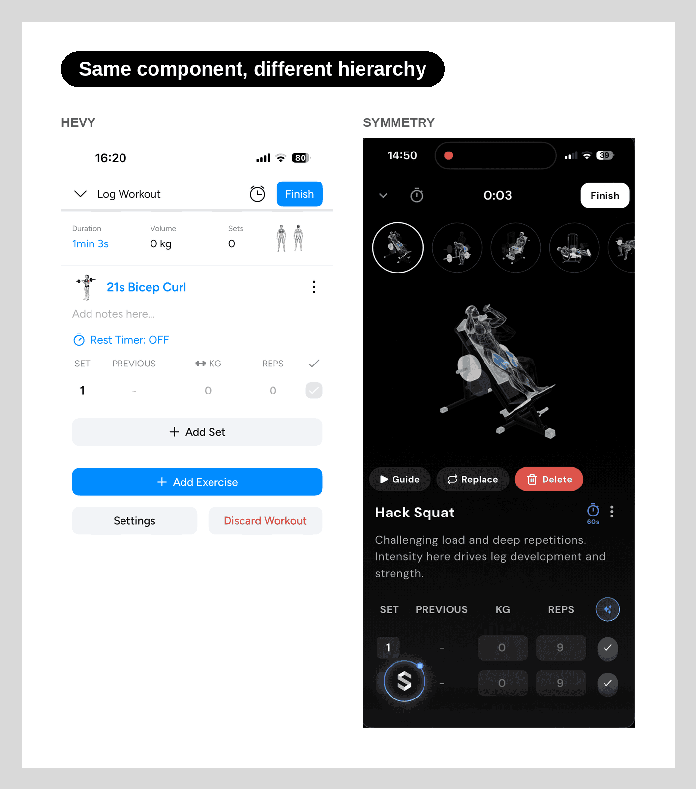
Diagnosis: new users know they want to train. The screen just doesn't tell them what to tap first, and that's a design decision the team can change
Solution
Three experiments against the same problem, at three levels of intervention, from lightest to deepest: a copy change, a guide on top of the current screen, and a restructured flow. Each can be tested on its own, and the winner can be combined with the others.
Shared metric: percentage of users who log a complete first set, meaning weight, reps and the checkmark.
1 · Expectation reset · copy only. One line when the first set opens: "Every set counts. Log the weight and the reps, then tick when you're done." It tells the user what's expected at the moment they need to know. It addresses the expectation gap and needs no design work. Guardrail: the line shouldn't slow logging or feel like clutter.

2 · Guided path · flow. Pick a preset workout or build your own, then everything dims except one action: weight, then reps, then tick. It delivers the guidance "Start" suggests and clears the overload. Guardrail: the guidance can't become friction of its own. It shouldn't slow the first set, nobody should drop out mid-tutorial, and experts need to be able to skip it.

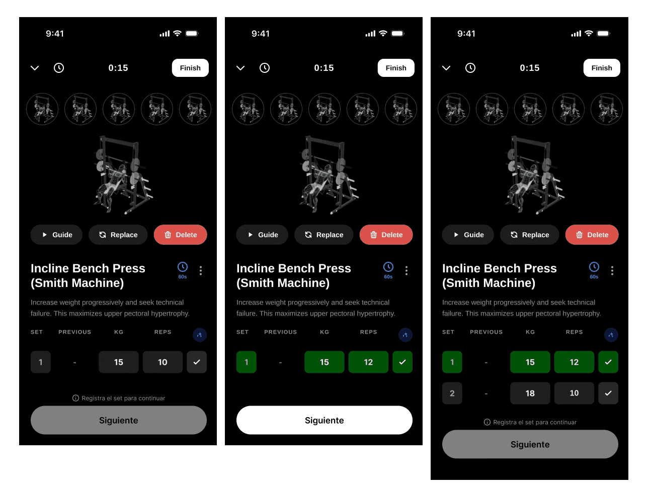
3 · Logging as the way forward · structure. One set per screen instead of one screen holding everything. The user sees only the current set and a "Next" button that activates once the data is in. Logging stops being optional and becomes how you move forward.
Screen 1: one set, plus "Next".
Screen 2: set 1 done and marked green, set 2 waiting, "Next" again once it's filled.
Helper text above the button: "Log the set to continue."
So a beginner isn't blocked by not knowing what weight to use, fields arrive prefilled with a suggested value, either from the previous session or a recommended starting point. Completing a set becomes confirming rather than filling in from scratch. This is scoped to the first workout and to beginners, since experienced lifters will likely change the value anyway. Guardrail: forced progression shouldn't raise abandonment, prefilled values shouldn't create junk data, and experts shouldn't be slowed down.
This is the one I recommended. It handles B and C by changing the flow itself rather than layering guidance on top. It supports the business goal of deeper engagement, and it helps the beginners who need guidance most. Experiments 1 and 2 stay available as lighter, faster tests.
Whichever experiment wins, gamification can sit on top: points for finishing a first workout, connected to the Get Started Challenge Symmetry already runs. It builds on what makes the product distinct, the rankings and the social layer, without muddying the core test.
How I'd measure it: an A/B test against the current flow, with enough users and enough time to trust the result. At least one to two weeks, to cover a full weekly training cycle.
Results
The Symmetry team confirmed they were already heading toward experiment 3, building logging into the flow rather than leaving it as an optional action. Reaching the same structural answer independently, from the data alone, was a strong signal that the direction is right.
The work delivered a reasoned case alongside the screens. Four plausible hypotheses, narrowed to one by asking which could explain a drop that grows as experience shrinks. Three options sized by cost to ship, so the team could choose its level of risk instead of receiving a single take-it-or-leave-it redesign. And a clear way to measure whether any of it works.
When completion tracks how much your users already know, the fix is to stop assuming they know it. Guided by default, depth on demand.