
Written by:
Biarnés, Adriana
Published on:
BRANDING
UX/UI DESIGN
ACCESSIBILITY
DESIGN SYSTEM
CONTENT DESIGN
CLIENT
Arctik Crew
PRODUCT
Recruitment and workforce support for Greenland operations
AUDIENCE
Practical workers relocating to the Arctic, and companies hiring for remote projects
STAGE
Pre-launch rebuild
DURATION
Design Partner (1 month)
MY ROLE
UX Designer
Challenge
Darío already had a website. He had paid for it, it was built, and it was live. He did not like it.
He could not say exactly what was wrong, which is normal. What he could say was this: the message is not clear, it does not look like us, and it looks like every other recruitment agency out there. He wanted people to understand what Arctik Crew does, and he wanted the site to feel different from the competition.
So I started by looking at who actually uses the site.
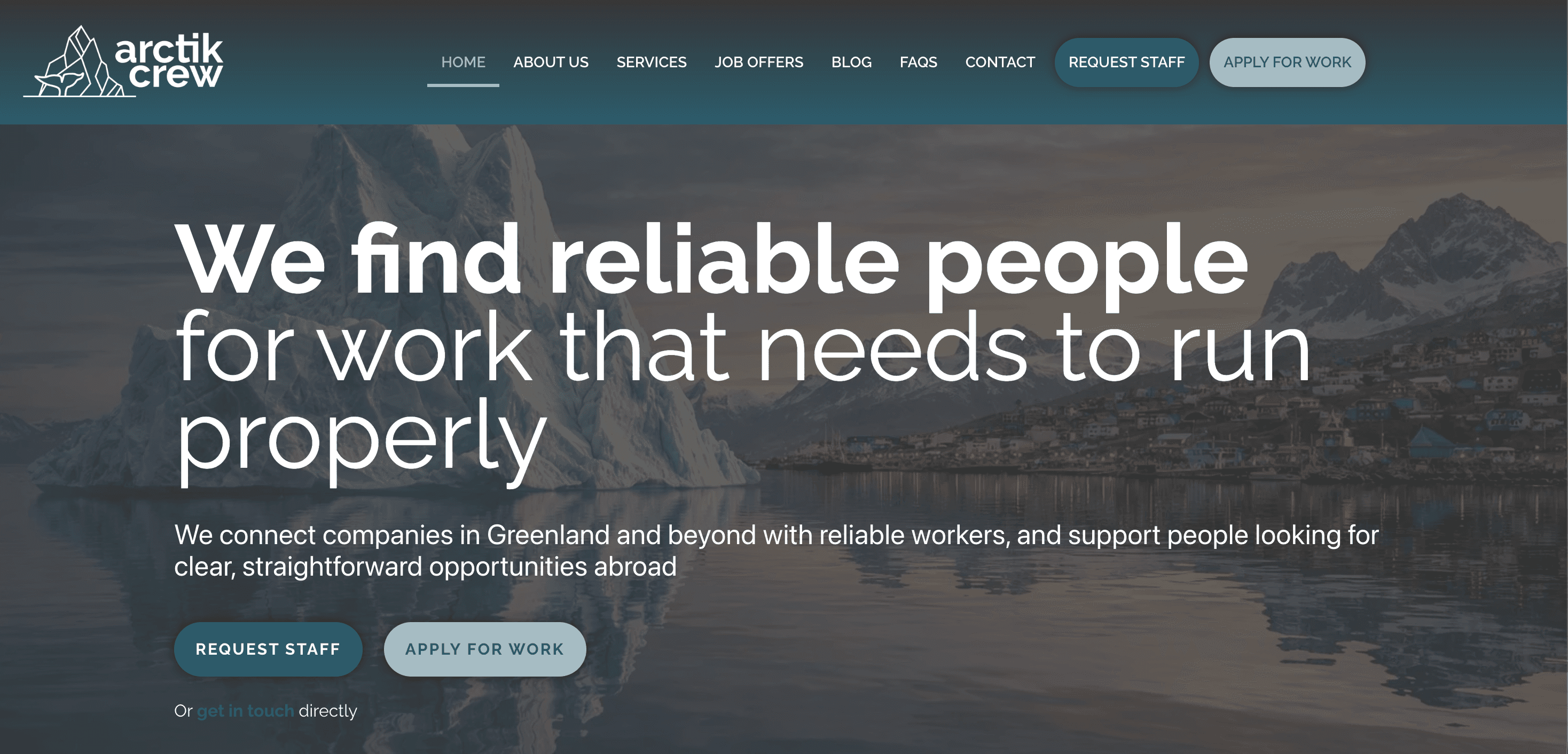
Before: the homepage spoke to companies and workers at the same time, so it spoke clearly to neither.
Arctik Crew has two audiences. Companies in Greenland who need crew, and workers who might go and do the job. Companies pay the bills. But the worker is the one taking the risk.
A company sends an enquiry and waits for a reply. A worker leaves home, flies to the Arctic, and lives somewhere they have never seen, for months, for an employer they have never met. If the worker does not believe you, there is no business. That person was the one the old site was not serving.
The old homepage led with "We find reliable people for work that needs to run properly." It is a fine sentence. It is also about the company, not about the person reading it. Underneath, both audiences were served in parallel columns, which meant a worker had to read past the employer content to find anything for them.
Then there were the details that quietly cost trust.
The testimonials were still Lorem ipsum, attributed to John Doe, CEO, with a blank grey avatar. That was live on the site.
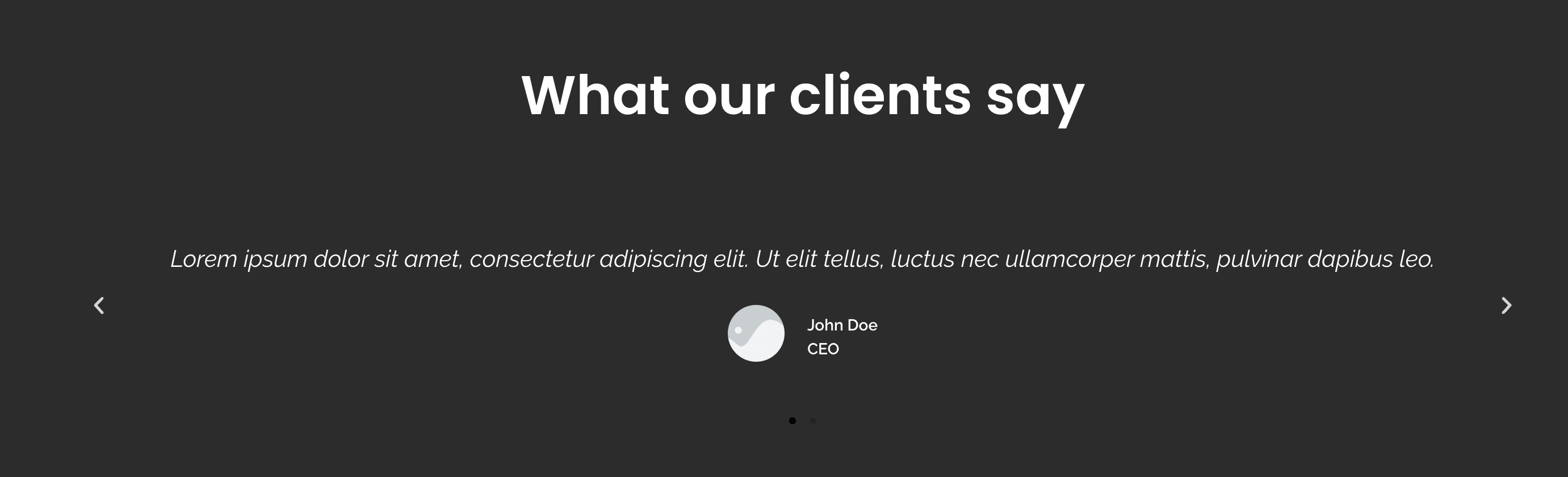
Before: the social proof section, live, with placeholder text and a placeholder person.
The contact address in the footer was info@artikcrew.com. The company is Arctik Crew. The letter c was missing, so mail sent to that address went nowhere.
Eleven FAQs, and almost all of them were written for employers. "Ready to hire smarter, let's talk." "We help you find talent quickly and confidently." Nothing there answers the question a worker actually has, which is whether this is real and whether it will cost them anything.
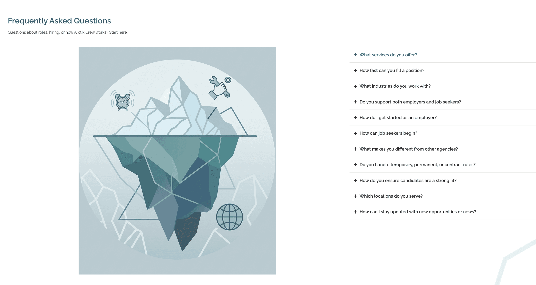
Before: eleven questions, written almost entirely for the people who are not taking the risk.
The job listings showed a location and a contract type. No pay.
And every page carried a noindex tag, so none of it was in Google.
Approach
Approach
I read everything they had before I designed anything. A 32 page source of truth document, the brand manual, three legal drafts reviewed by their lawyer, and Darío's own emails explaining how the process really works.
That last part mattered most. The way he described the process in an email was clearer and warmer than anything on the website. It was all there, just not on the page.
Then I mapped the two journeys separately, because a worker and a company want opposite things from the same homepage.
Three decisions came out of that.
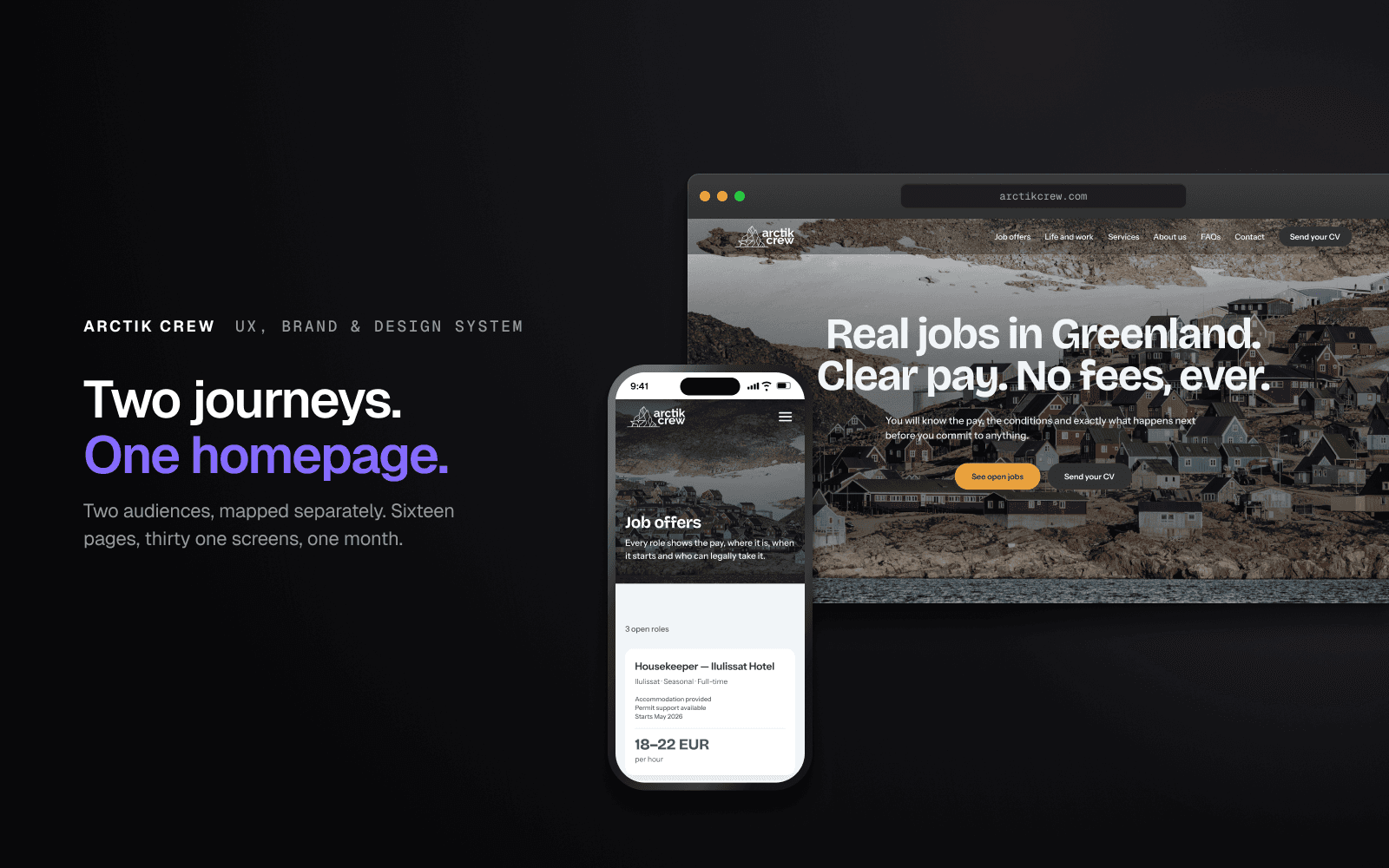
Put the worker first. The site now leads with the worker, and companies are reached through the navigation, a dedicated section on the home page, and the whole Services page. The worker is the harder sell and the bigger risk, so they get the front door.
Publish the pay. Most recruiters in this sector do not. Listings say competitive rates, and the number arrives in a phone call once you are already invested. Arctik Crew knew their rates. Putting the figure on the card turns their honesty into the first thing you notice. Where an employer has not confirmed the rate yet, the card says "Rate to be confirmed", and it deliberately looks weaker next to the ones that name a number.
Say the fee thing properly. Workers in this sector get charged by agencies. Application fees, document fees, placement fees. Arctik Crew charges workers nothing, employers pay. The old site said "clear, upfront costs, no hidden fees", which accidentally implies there are costs. Now the site says it plainly: you will never pay for a job.
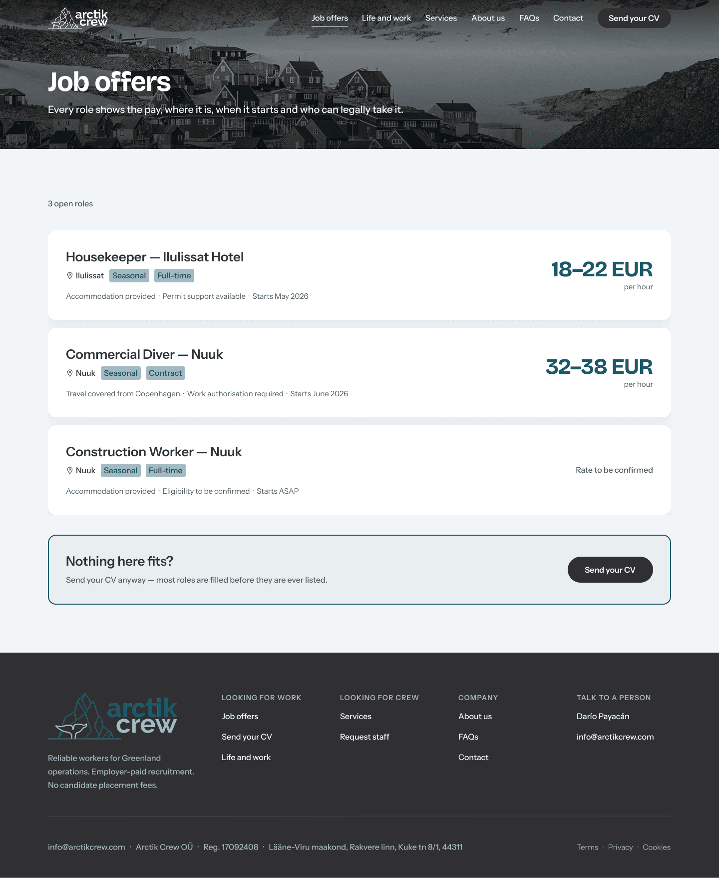
After: every role shows the pay, where it is, when it starts and who can legally take it.
Solution
Sixteen pages, designed at desktop and mobile. Thirty one screens in total.
The homepage answers three things in one scroll. Is this real, what does it pay, what happens next. Open roles are the second block because that is what people come for.
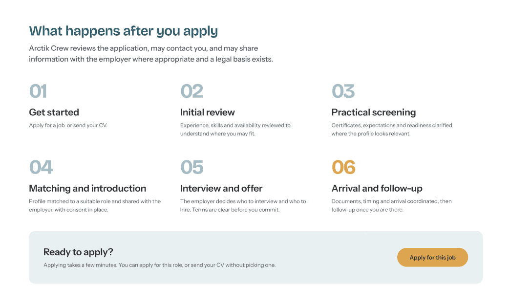
The process is the six steps Darío wrote himself, with the two entry points, worker and company, joining into one shared route. Nobody had to invent it. It just had to be shown.
The colour system gave the site a rule it did not have before. Amber is action, blue is orientation. Everything amber is something you can do. Everything blue tells you where you are. After two screens you stop looking for the button.
The brand manual had specified a dark red accent. Measured against the brand teal it scored 1.16 to 1, where the accessible minimum is 4.5 to 1. I checked whether any red would pass and none does. That is arithmetic, not taste, so red came out and amber went in.
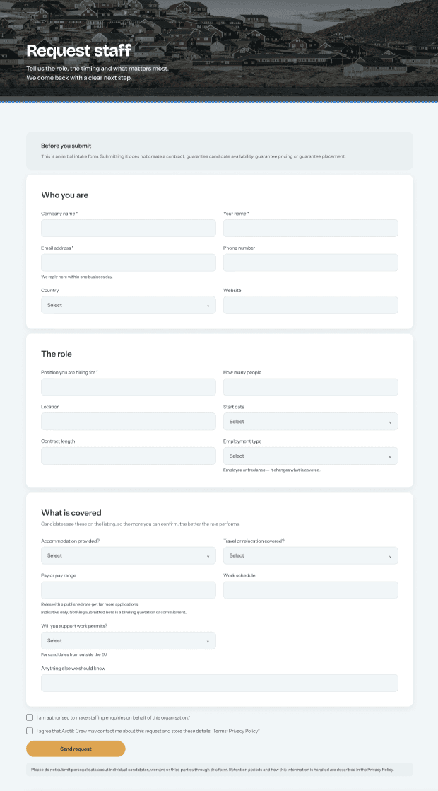
After: the employer form now starts by asking who is asking. The old one never did.
The employer form was the other thing worth fixing. It asked about the role, the location, the schedule and the conditions across forty five fields, and it never asked for a name or an email. A company could fill in the whole thing, send it, and disappear. Every enquiry that arrived was impossible to answer.
The new one starts with who you are. Forty five fields became seventeen, in three groups.
For workers, the application was reduced to one form serving both routes. Arrive from a job and the role is locked at the top. Arrive without one and you send a profile. From the second question down it is identical.
Only three fields are required. Everything else is optional and says so. Every extra required field is a place where someone gives up, and this business needs more applicants, not fewer.
The consent wording came straight from their lawyer's review. Nationality was replaced with a work authorisation question, because nationality should only be asked where it is genuinely needed. The age confirmation explains why it is being asked. Both optional consents now point at the retention period in the privacy policy.
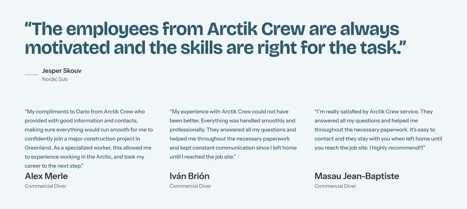
After: real reviews from people who actually went, with their names and their roles.
The Lorem ipsum came out and three real worker reviews went in, alongside the one approved company review. All three workers independently mention the same thing, which is that somebody stayed in contact with them from the day they left home until they reached the site. That is the proof. It just needed to be visible.
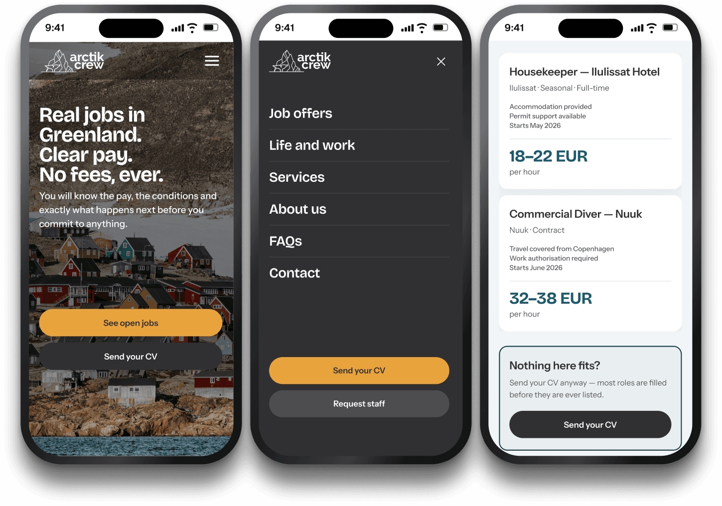
Mobile was designed alongside desktop, not after it. Most of these candidates apply from a phone.
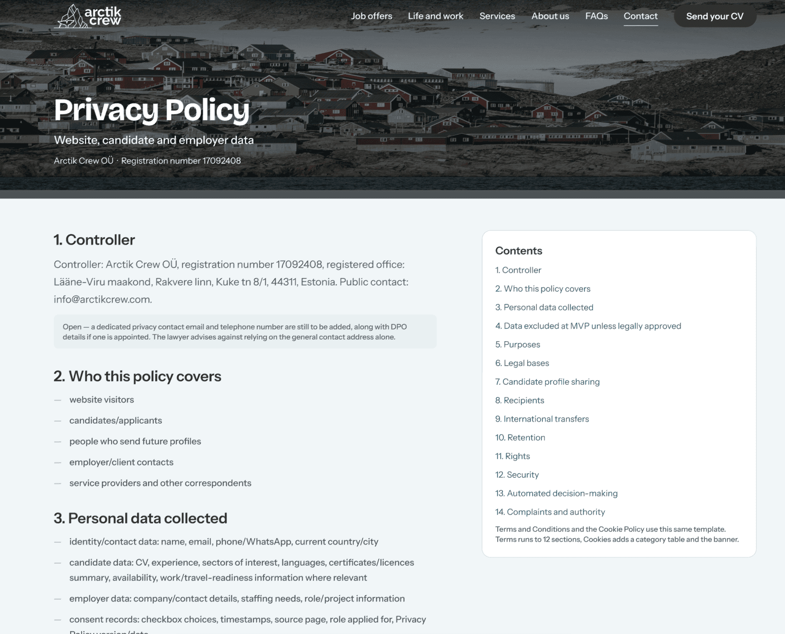
The legal pages were built at their real length, with the lawyer's draft status visible at the top and every unresolved clause flagged where it sits. A legal page that looks finished when it is not is a real risk, and design can either hide that or make it impossible to miss.
Results
The site has not launched yet. It goes live once the legal review is signed off, so there is no traffic data, and I would rather say that than make something up.
What did change is easy to measure.
The employer form went from zero contact fields to four required ones, and from forty five fields to seventeen. Every job listing now shows pay or states clearly that the rate is not confirmed. The placeholder testimonials and the broken email address are gone. The site went from zero indexed pages to a full sitemap, with every empty state designed next to its full one, including the launch state, which is the one that ships first.
Every colour pair was checked against WCAG AA by calculation rather than by eye. Every text style, colour and component sits in a library, so a change propagates instead of needing to be hunted down.
And when their lawyer opened the file, the changes she had asked for were already in it.
A company sending an enquiry risks a wasted email. A worker risks their next six months. Design for the person with more to lose, and the other one is convinced anyway.

