
Written by:
Adriana Biarnes
Published on:
Mobile App Design
UX Redesign
Travel App
B2B
Startup
CLIENT
Tassie
PRODUCT
Self-guided city tours mobile app
AUDIENCE
Tourists (B2C) and hotels & companies (B2B)
STAGE
Pre-growth redesign
DURATION
10-day sprint
MY ROLE
Product Designer

Challenge
Tassie is an Amsterdam startup that turns city tourism into something more cultural, more social, and way less cliché. Users explore cities through curated walking routes that mix landmarks, hidden gems, and conversation prompts at every stop.
The business runs on two tracks at the same time. B2C: tourists buy tours directly in the app. B2B: hotels and companies buy access codes and give them to guests or employees to unlock tours for free.
One app. Two completely different users. And at the time neither journey was working well.
The original app had friction at every turn. Redundant buttons showing up where they shouldn't. Unclear states that left users wondering what to do next. A gamification system, points and achievements, that had no clear purpose and confused more than it motivated. Visuals that felt flat and generic for an app targeting young, curious travelers. And for the B2B side? There was no real flow at all, which was a problem because that's the direction the business needed to grow.

Approach
Two weeks. Full-time. Solo.
With that kind of timeline there's no room for extensive research, so I went straight to benchmarking. Airbnb, GetYourGuide, Headout. What do the travel apps that actually convert have in common? Three things came up consistently: large immersive imagery, one clear action per screen, and a tone that feels like a recommendation from a friend rather than a listing from a travel agency.
That became the filter for every decision.
The goal wasn't to reinvent Tassie. The signature red, the playful energy, the Amsterdam soul: those stayed. The job was to remove the noise, clarify the paths, and build a proper flow for each user type so neither one had to navigate through the other's experience.
Low-fi sketches first to map the new flow and cut what wasn't needed. Then wireframes. Then the full UI.

Solution
Here's what shipped.
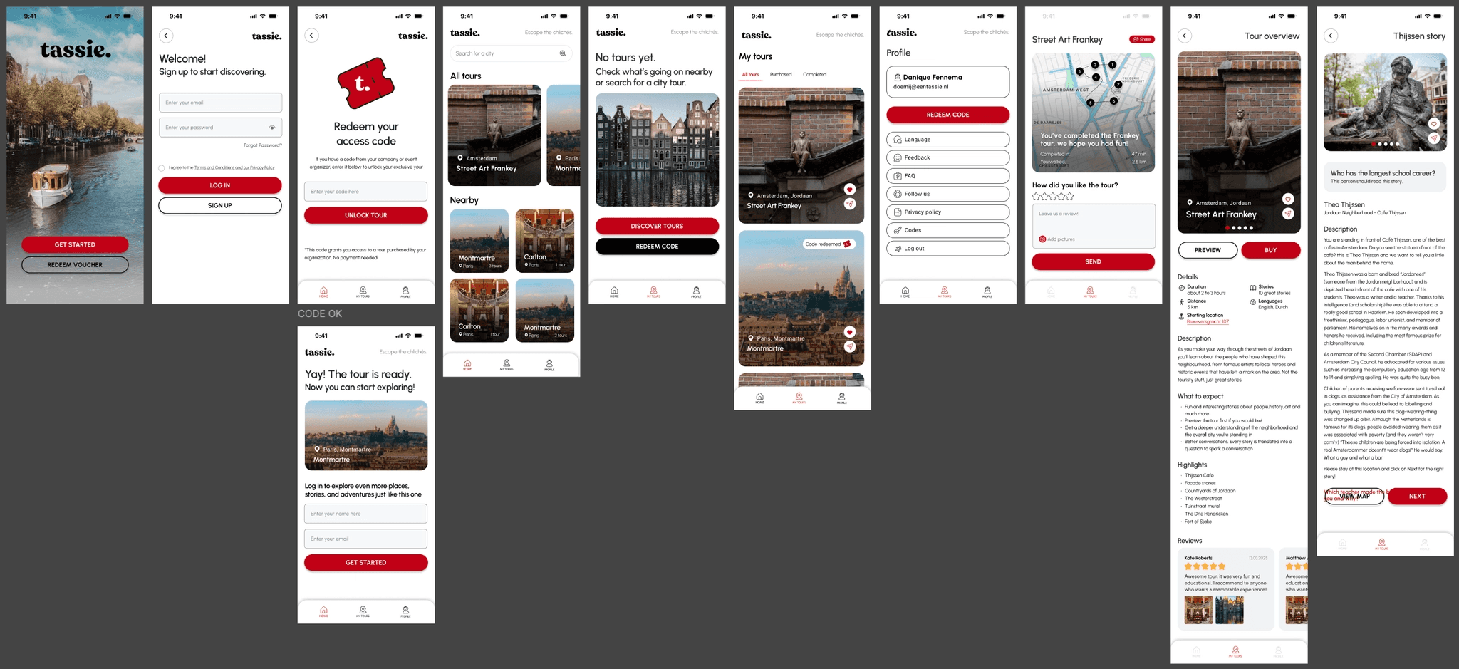
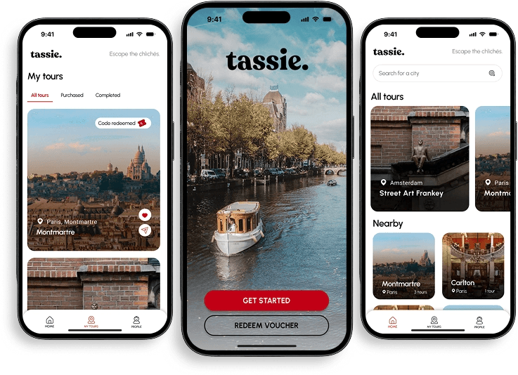
Onboarding: fast, visual, sets the tone in one screen. One promise, one action, done.
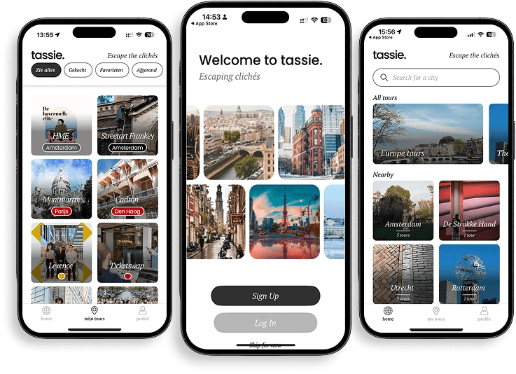
Home: full-width imagery for each tour, city categories, nearby suggestions. Content-first, no clutter.
B2B code flow: enter a code, unlock a tour, start exploring. Completely separated from the purchase flow so hotel guests never encounter a paywall that doesn't apply to them.
My Tours: tabbed between all tours, purchased, and completed. Clear states. No redundant actions.
Profile: compact. Completed tours, saved tours, settings. Nothing extra.
Tour detail: rich imagery, full description, highlights, reviews, and a clear preview vs. buy decision. Everything a user needs to decide without leaving the screen.
Full UI delivered with a refined logo, updated iconography, and a spacing system built to scale.


Results
The founder called it "exactly the vibe we wanted. Modern, visual, and ready to sell."
Hotels responded positively to the new experience. Before the redesign, there was nothing clean to show B2B partners in a demo. After, there was a focused, intuitive flow that made the pitch make sense.
The B2B onboarding became a proper sales tool. The simplified UX gave the team something they could actually put in front of hotel partners and say: this is what your guests will see.
Sometimes good design is not about reinventing. It's about removing what's in the way.
